The Discover Pro toolbox, to the left-hand side of the canvas, lets you access key functions when building your discovery. Most of these functions allow you to change your visualization type either to one of the out-of-the-box types or to a custom type. In addition, there are also selector tools that allow you to select the content items in your discovery. You will use these options when building the content for each of your visuals.
- For more general information about the workspace, see Discover Pro Workspace
Toolbox
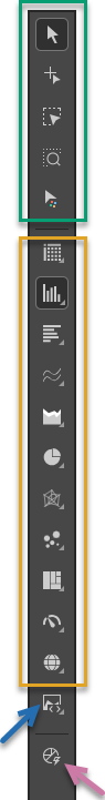
Selection / Interaction tools
The selection options (green highlight) control what your cursor does when you select items on the canvas.
|
Function |
Description |
|---|---|
|
Default Selector |
The default selector option. When this option is selected, clicking an item on the canvas selects it. |
|
Use the Item Picker tool to select multiple items at once. This tool is useful for non-contiguous selections, since you select the data points or members one-by-one rather than "lassoing" a set of items. Tip: Alternatively, you can also use |
|
|
Use the Select Lasso to select multiple items at once. This tool is useful for picking contiguous selections, since it allows you to "lasso" a set of data points or members. As well as selecting your lassoed items, you may also be able to focus on or classify your selected items, depending on your visualization type. |
|
|
Use the Zoom Lasso to select multiple items at once and to zoom in on your selection. This is useful for contiguous selections, and where you are selecting a small subset of items and want to interact with just that subset. |
|
|
Format selected items on the canvas. When this option is selected, the canvas transforms into an intuitive, point-and-click formatting area. Hover your cursor over the content items on the canvas to highlight them for selection; then, once selected, make your changes from the Formatting panel. |
Out of the box Visualization Types
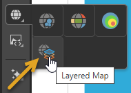
Use the Visualization Type selectors (orange box above) to choose an out-of-the-box visualization type for your data. In each case, you can right-click the root visualization type to open the submenu and, from there, select a visualization type. For example, to change your visualization into a Layered Map you can right-click Maps > Layered Map (orange arrow below):
To learn about each of the visualization types, follow the links below:
KPI charts
KPI charts are used to visualize your KPIs as a gauge or bullet chart. You can typically choose from two KPI chart types:
- Gauges
- Bullet chart (Discover Pro only.)
Grids
Grids are used to present data in rows and columns. You can typically choose from three grid types:
- Matrix Grid
- Tabular Grid
- Raw Grid (Discover Pro only.)
Cartesian charts
Cartesian charts plot data across two axes (a y-axis and an x-axis), which meet at 0.
Column charts
Not available in Smart Discover (Discover Pro and Lite only):
Bar charts
Line charts
- Line chart
- Spline chart
- Step line chart
- Point chart
- Lollipop chart
- IBCS-like line chart (Not Smart Discover)
- IBCS-like lollipop chart (Not Smart Discover)
Area charts
- Area chart
- Stacked area chart
- Stacked 100% area chart
- Stream area chart
- IBCS-like area chart (Not Smart Discover)
Segment charts
Segment Charts display each element of the given hierarchy as a different segment of the chart, with each element represented as a proportion of the whole, based on its value.
Radar charts
Radar charts are used to plot one or more series of values across multiple quantitative variables, which are represented on axes extending from a central point.
- Radar line chart
- Radar area chart
- Radar smooth line chart
- Radar area smooth line chart
- Radar point chart
Plotted Charts
Plotted Charts (or Multi-Variable charts) plot two hierarchies across Cartesian coordinates. They are useful in finding correlations in the data set.
Advanced Charts
Advanced Charts plot multiple hierarchies in ways that can be more interesting than a typical Cartesian chart.
- Tree Map Chart
- Hierarchical Tree Map Chart
- Circle Packing Chart
- Hierarchical Circle Packing Chart
- Sankey Chart
- Word Cloud
- Sunburst Chart
Maps
Maps plot data geographically and are an excellent way to visualize the spread of data across geographical locations.
Other Visualization Types
Custom Visualizations
Use the Custom Visualization Type selector to choose a custom visualization type for visualizing your data. Tip: To learn about each of the custom visualization types, hover your cursor over the custom submenu items to open a tooltip.
Auto Recommend
Click Auto Recommend to prompt Pyramid to select the most appropriate visualization type for the data that is currently added to your visual. Right-click to select from a set of recommended visualization types.