The Master ribbon is shown at the top of the Present Pro workspace when you are editing the local Master for either your Content or Cover pages. These masters control the look and feel of the cover and all of the body pages (content) in your presentation. For example, specifying which navigation options are in use for the whole presentation, specifying the canvas or background color for every slide, and so on.
Note: Any changes you make to the masters will affect either the cover page or all the body pages of the presentation. If your presentation does not include a cover, changes to the cover master will not affect the presentation. Changes to the Content master will affect all pages apart from the cover page.
- Click here for more information about Master pages
Opening the master pages
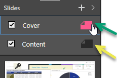
The master pages associated with your Content or Cover are opened for editing by clicking the Slide option in your Slides panel. There are two different "masters," and two different options:
- Cover: (green arrow) controls the appearance of the first page where this presentation includes a cover. Note that the presentation includes a cover if the checkbox is selected.
- Content: (yellow arrow) controls the appearance of all other pages apart from the cover in this presentation.
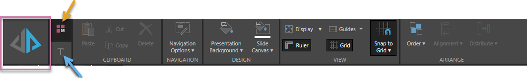
Note: You can tell you are editing the master on the canvas, and not a page in your actual presentation, because the presentation background displays a hashed pattern and the Master ribbon (M) is shown above the canvas.
- Click here for information about the Slides panel
Master page ribbons
Run presentation
Click Run Presentation (purple highlight, above) or press your F2 key to run the presentation. The runtime version of the presentation builds and opens in Present, with the slide that is currently open showing as the first page. Tip: Always save your presentation before you run it; this ensures you include your recent changes. Note: You should run your presentation regularly as you customize your masters, to ensure that the changes you are making appear as you expect them to.
Ribbon selection
The master ribbon is split into two sections. To access the required ribbon, simply click its corresponding button as indicated in the preceding image:
- Master ribbon (orange arrow above).
- Component ribbon (blue arrow). The content of this ribbon, and its icon, depend on which content item is selected on the canvas.
Master ribbon
You should think of the selections made in the master as either settings that apply to the whole presentation (headers and footers, for example) or defaults that apply to new slides in this presentation. You can override many of the options in the presentation itself; for example, a change to the Slide Canvas in the Content master sets the color for every new slide in the presentation, but you can override it for one particular slide by changing the Slide Canvas option in that slide.
Tip: The links below take you to the pages that describe the functionality when editing your slides. The behavior is the same for masters, but the changes affect all slides or the cover and not just one slide.
|
Function |
Description |
|---|---|
|
Access copy, paste, cut, and delete functions. |
|
|
Navigation Options (Masters only) |
Specify how you would like to navigate around the presentation at runtime:
|
|
Presentation Background |
Change the default color of the presentation background (behind the slide) using the Color Picker. |
|
Slide Canvas |
Change the default color of the slides themselves using the Color Picker. Note: Changing the Slide Canvas for the Content master will, effectively, change the color for all new slides in the presentation, and any existing slides that do not have their own slide canvas color set, except for the Cover. |
|
Change the display size to fit the slide; options are relative to the entire canvas size. The options are: Fit to Page, Fit to Width, and Actual Size. |
|
|
Show or hide the ruler along the top and left-side of the canvas. |
|
|
Add guidelines to the canvas, to help you with the layout of your presentation. |
|
|
Show or hide the background grid. This is only relevant to a presentation with a fixed layout. |
|
|
Enable or disable "snap to grid" for items added to the canvas. |
|
|
Change the stacking order of the selected item, as layered on the canvas. |
|
|
Align an item to a location on the slide or align a collection of items to each other. |
|
|
Tools to vertically or horizontally space a collection of items; you must select at least three items to enable this tool. |
Component ribbon
The Component Ribbon offers settings and formatting choices that affect the look and feel of any currently selected item on the canvas. Note that the selected illustration, text, and so on will appear on every page affected by the master.
|
Function |
Relevant Item |
Description |
|---|---|---|
|
Rotate |
Illustration; Shape; Image; Web Page |
Rotate by 45, 90, 180, or 270 degrees, or Reset to original rotation. |
|
Size and Position |
Illustration: Shape; Text; Image; Scrollable Panel; Web Page; Matrix Table; Tab Layout; Fixed Navigation Options |
Change the size and position of the selected item:
Tip: The X and Y coordinates and width and height are displayed underneath each content item when it is selected. |
|
Border Thickness |
Shape |
Change the thickness of the border around your selected shape. |
|
Stroke |
Shape |
Select the border color used for the selected shape. |
|
Fill |
Shape |
Change the fill color used for the selected shape. |
|
Dynamic Text |
Access the copy, cut, and paste functions for the selected dynamic text. Note that these options apply to both the text itself and the underlying dynamic logic. |
|
|
Dynamic Text |
Configure dynamic text from within your presentation using the Dynamic Text wizard. |
|
|
Text |
Toggles the selected text box between Graphic Text, which resizes automatically with the text field, and Standard text, which must be resized manually. Use the dropdown options to scale the Graphic Text automatically. For example, select 2 from the dropdown list to double the size of the text in the selected graphic text box. |
|
|
Text |
Change font type, size, color, emphasis, shadow, strike through, spacing, letter case, background color, text box border color, text box border width, and text background color. |
|
|
Text |
Change paragraph formatting. |
|
|
Text |
Apply different heading styles. |
Fixed Navigation Options
The Fixed Navigation Options are those buttons, dropdown lists, and tabs that appear on every page of your presentation, and that can only be customized in the master. They include the Hamburger Menu (top-left), Basic Options (Undo, Redo, Reset, and Rerun icons), and the Navigation Options (Arrows, Tabs, and Drop-down).
|
Function |
Relevant Item |
Description |
|---|---|---|
|
Foreground |
Hamburger Menu; Basic Options; Tabs |
Change the item's foreground color using the Color Picker. |
|
Background |
Hamburger Menu; Arrows; Tabs; Drop-down |
Change the item's background color using the Color Picker. |
|
Navigation Text |
Tabs; Drop-down |
Change the font details used for the Fixed Navigation Options. |
|
Always on Top |
Hamburger Menu; Arrows; Tabs; Drop-down |
Indicate that the selected navigation item should always be positioned on the top layer. This ensures that images or other items cannot obscure the navigation option. |
|
Outline |
Arrows; Drop-down |
Change the color of the arrow itself using the Color Picker. |
|
Button Color |
Arrows |
Change the color of the arrow background (the circle containing the arrow) using the Color Picker. |