The formatting tools for gauges enable you to change the design of the gauges, change the background color, and scale the chart down to fit the canvas. With the Gauge Chart selected from the Formatting panel dropdown list, the Design, Fill, Settings, and Miniature tabs are exposed.
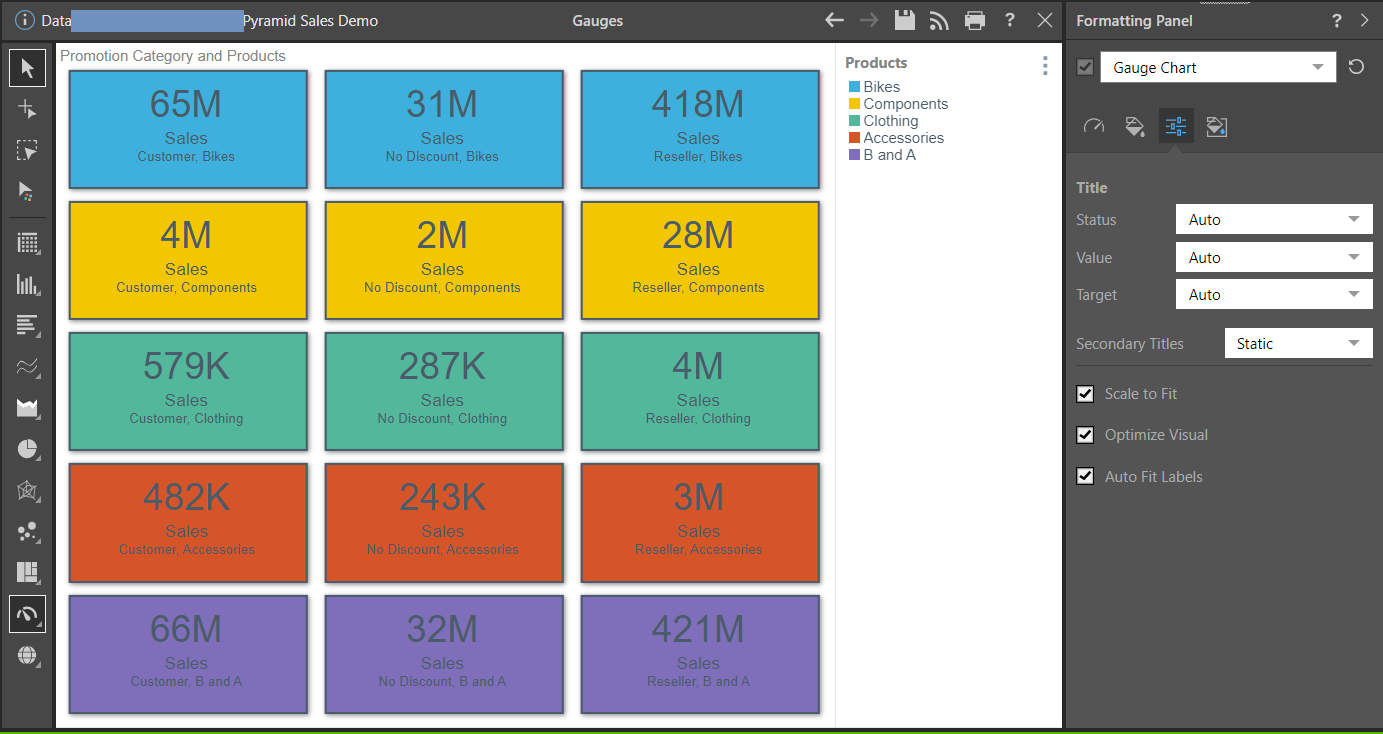
Gauge Chart Formatting Panel
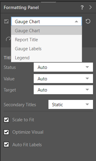
Select Gauge Chart from the top dropdown list in the Formatting Panel:
The options on each of the tabs will change some aspect of the Gauge Chart formatting.
Tip: You can move between these options and other formatting options using the dropdown list at the top of the formatting area (see above). For more information, see Related information below.
Design
From the Design tab, adjust the overall look and feel of the gauges in the chart.
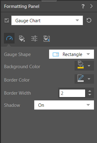
- Gauge Shape: Display the gauge as a square (default) or rectangle.
- Shadow: Show a shadow around each gauge.
- Radius: Apply a curve to the corners of the gauge. Where the radius is 0, the tiles have right-angles for corners. Increasing the radius adds a curve to the corners, making each gauge into a rounded rectangle. The larger your Radius is, the more pronounced the curve is.
Fill
From the Fill tab, change the report background color.
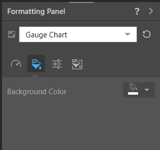
- Background Color: Change the color of the Report Background using the Color Picker tool. This change does not affect the chart background.
Settings
From the Settings tab, customize titles, and scale the visual.
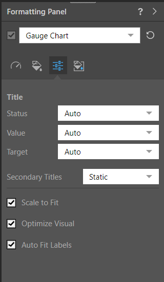
Title
- Status: Use the auto title or set a custom title for the status chip.
- Value: Use the auto title or set a custom title for the value chip.
- Target: Use the auto title or set a custom title for the target chip.
- Hide Titles: To hide a title, set it to Custom and then hit the space bar; the title will be hidden from the gauge.
- Secondary Titles: Set to Static to show value labels as "Status," "Value," and "Target." Set to Dynamic to use the current measure as the title.
Visual Options
- Scale to Fit: Scale the visualization down to fit on the canvas.
- Optimize Visual: The visual optimization engine in Pyramid is a heuristic that automatically redacts certain parts of a graphical visualization based on the amount of space provided.
- Auto Fit Labels: Toggle between auto fitting the labels to the space available and using fixed sizes for the label text. Note: When Auto Fit is off, the font sizes are determined using the Gauge Labels settings.
Miniature
 Miniature Color 1, 2, and 3 set the text colors for miniature visuals, which appear automatically when a visual is scaled down due to legibility limits. These miniatures show measure values and labels for quick reading in limited space. Use the Color Picker to set the color for each miniature tile.
 Example: Miniature Colors
Miniature visuals are created automatically when you scale a visual down to a size that makes its content illegible. These tiles typically display the measure as a number with its name underneath:
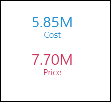
Note: The purpose of a miniature visual is to provide a way to easily view and interpret important data at a glance, even where there is a lot of information and limited space.
Example
In this example, the chart was scaled down and the mode was changed to Rectangle:
Related information
Other Formatting Options
In addition to editing the Gauge Chart Formatting as described above, you can also edit other formatting options by selecting the other options in the dropdown list at the top of the formatting panel:
- Report Title: Customize the report title.
- Gauge Labels: Customize the labels on the gauge charts.
- Legend: Edit the legend by changing its position, layout, and fonts.
- Plot Area: Customize the plot area by changing the background color, adding borders, and, where applicable, changing the axes.
- Color: Customize the fill type and color for Gauge and Bullet shapes.