The Publish Lite ribbon, along the top of the Publish Lite workspace, provides options for formatting and managing the appearance of your publication. When you select different content items on the canvas, different options are shown on the ribbon. For example, you always see the Add Page option, but you only see font formatting options if a text field is selected.
- For more general information about the workspace, see Publish Lite Workspace
Common options

|
Function |
Reference Highlight |
Description |
|---|---|---|
|
Build Publication (F2) |
Purple arrow |
Click Run Publication (purple highlight) or press your F2 key to open the Print & Export dialog and manually print your publication. |
|
Green arrow |
Add a new page to your presentation. Tip: You can also create a new page from the add button at the top of the Page panel. |
|
|
Black arrow |
Add, remove, and edit interactions between slicers and visuals on this page of the publication. In Publish, these interactions are used to filter content items when exporting or subscribing to the publication. |
|
|
Orange arrow |
Choose or change the theme used by the publication. The theme controls design features such as the color palette, font family, master pages, and so on used by the publication. |
|
|
Canvas Color |
Blue highlight |
Change the background color for the currently selected page using the Color Picker. |
|
Enable or disable "snap to grid" for items added to the canvas. |
||
|
Include a publication cover:
Note: The appearance of your cover is controlled by its "master." Publish Pro users can update the cover master, changing its layout and appearance as required. For more information, see Master Pages in Publish Pro. |
||
|
Align selected items vertically and horizontally. Note: This option is only enabled where multiple content items are selected on the canvas. |
||
|
Yellow highlight |
In Publish Lite, the status bar functions include options to close the currently open file, open the help, save the current file, undo and redo changes, and zoom in and out of the canvas. |
Visual formatting
If you have a visual or group containing visuals selected on the canvas, the following options are shown on the ribbon in addition to the Common options:
|
Function |
Reference Highlight |
Description |
|---|---|---|
|
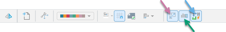
Purple arrow |
Allow Pyramid to re-size the selected visual to fit its container automatically. This is typically useful where the visual is larger than the space available in its container and only part of the visual is visible without scaling; for example, if you have a large Matrix Grid with lots of columns of data and you prefer to scale the visual down than to re-size the container on the canvas. |
|
|
Green arrow |
If your visual includes a legend, selecting this option shows that legend inside the visual container. This is typically useful where there is no independent legend or the visual does not share its legend with other visuals. |
|
|
Blue arrow |
Allow Pyramid to generate a "miniature visual" when you shrink your visual down to a size that renders it illegible. A miniature visual shows the measure name and number in place of the visual that can no longer be read. |
Text formatting
If you have a text box or group containing text boxes (containing either a variable text field or static text) selected on the canvas, the following options (blue highlight) are included on the ribbon in addition to the Common options:

|
Function |
Description |
|---|---|
|
Add a placeholder to your page. The placeholder can be replaced with a value from a slicer when the publication is built. |
|
|
Change the font type, size, emphasis (bold and italic), and text color. |
|
|
Apply a preset style to selected text. When you build your publication, text using a Heading style is typically included in the table of contents. If your publication is a PDF, the Heading styles also determine the hyperlinks included in the document outline. For more information, see Adding a Table of Contents in Publish Lite. |
Shape formatting
If you have a shape or group containing shapes selected on the canvas, the following options (blue highlight) are included on the ribbon in addition to the Common options:

|
Function |
Description |
|---|---|
|
Stroke Color |
Select the border color used for the selected shape. |
|
Fill Color |
Change the fill color used for the selected shape. |