There are a wide range of functions available from the right-click context menus. Which options are included on the menu, depends on the content item that is selected on the canvas. You typically use the right-click menus when you are professionalizing your presentation; for example, when you add Jump Actions to shapes, when you align slicers and visuals, or when you are opening the visuals and other content items in apps for extended editing.
- Click here for more information about the canvas
Context menus
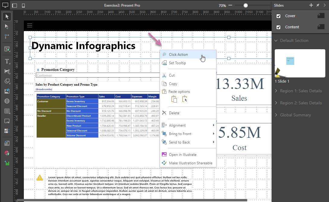
You can open a context menu by right-clicking an object on your canvas. The context menu shows options that reflect the currently selected item or items on the canvas. For example, the following image shows the context menu (purple arrow) for a Text box.
Basic content item options
The following table contains a Content item type column, indicating the type of item that needs to be selected on the canvas for the context menu option to be included on the right-click menu.
|
Function |
Content item type |
Description |
|
Visual |
Edit the formatting for the panel that contains the visual. Opens the Formatting panel. |
|
|
Slicer |
Configure the default behavior of the slicer, and set the type of elements used in the slicer. Opens the Slicer Settings wizard. |
|
|
Slicer |
Edit the formatting for the slicer. Opens the Formatting panel. |
|
|
Visual |
Set appearance settings for the visual, including Scale mode, Legends (Show / Hide and Optimization), Miniaturization, Auto fit labels (Gauges only), Range Slider (Show / Hide), Optimization, and Trellis. |
|
|
Slicer |
Apply scaling preferences to visuals. Slicer scale modes do not include Scale to Fit. |
|
|
Visual, Slicer |
Set up actions on the runtime context menu to jump to a slide, content item, tab (in mini-tabs container), or URL, or run some custom JavaScript. Alternatively, set up actions to open a tooltip "on hover." Slicer actions are limited to jump to tab only. |
|
|
Text, Shape, Image |
Set up actions to jump to a slide, jump to a URL, or jump to another visual when the selected item is clicked at runtime. (Configure an on-click event for the selected item.) |
|
|
Text, Shape, Image |
Where a click action has been defined for the selected asset, delete it using this option. |
|
|
Text, Shape, Image, Web Panel |
Create a tooltip that pops up when you hover your cursor over the selected item at runtime. (Configure an on-hover event for the selected item.) |
|
|
Visual, Slicer, Text, Shape, Image |
Cut or copy the selected object. |
|
|
All |
There are two methods for pasting an item:
|
|
|
Slicer |
Hide a slicer that is currently shown on this slide. Hidden slicers can be used to filter visuals and so on from the Present runtime menu, but they are not visible on the slide. Note: You can only edit these "hidden" slicers from the Slicers panel. |
|
|
Slicer |
Remove slicer interactions from other slides. |
|
|
Visual, Slicer, Text, Shape, Image |
Delete the selected object from the presentation. |
|
|
Visual, Slicer, Text, Shape, Image |
Not shown. Where two or more items are selected on the canvas, the items can be "grouped" using this option and the group can then be resized, aligned, moved, copied, cut, or pasted as if it were one item. |
|
|
Visual, Slicer, Text, Shape, Image |
Align the object with another object on the slide. |
|
|
Visual, Slicer, Text, Shape, Image |
Not shown. Where three or more items are selected on the canvas, they can be distributed relative to one another. |
|
|
Visual, Slicer, Text, Shape, Image |
Use one of the two options either to bring the object forward (in front of another item) or to the front (in front of all other items). |
|
|
Visual, Slicer, Text, Shape, Image |
Use one of the two options either to send the object backward (behind another item) or to the back (behind all other items). |
|
|
Visual |
Open the visual in Discover to make changes to it. |
|
|
Discovery |
Open a discovery in Discover without running the underlying query. This allows you to open and fix problematic content before you run the underlying query against the target data source. It is also useful for very large or long-run queries that can never run to completion. Admin only. |
|
|
Shape, Text, Image |
Open the selected item in Illustrate to make changes to it. |
|
|
Visual area |
Open the spreadsheet containing this visual area in Tabulate to make changes to it. |
|
|
Visual (linked only) |
Open the content item in its location in the Content Management System (CMS). |
|
|
Visual (linked only) |
Unlink a shared item from its source, making it a one-off visual that is relevant to this presentation only. |
|
|
Make Shareable |
Visual (one-off only) |
Save the visual to the content manager so that it can be shared and reused in different visuals, presentations, and publications. |
|
Make an Illustration Shareable |
Shape, Text, Image |
Save the shape or text to the content manager so that it can be shared and reused in different visuals, presentations, and publications. |
Layout container options
The following tables describes the right-click options that are specific to the layout containers where applicable.
- Click here for more information about Layout containers
Mini-Tabs
To access the mini-tab context menu:
- Right-click the borders of the mini-tab container (green highlight below).
- Right-click a visual inside the mini-tab. In this case, the mini-tab context menu is shown inside a Mini-Tab sub-menu.
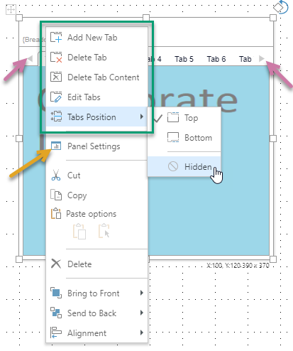
Tip: In addition to the mini-tab items, you can also access other items from the context menu. Where the border is selected, this includes the Panel Settings (orange arrow above) which opens the Formatting Panel.
|
Function |
Description |
|---|---|
|
Add New Tab |
By default, the mini-tab container has two tabs. Click this option to add another tab. Note that the new tab is added after any existing tabs by default, you need to Edit the tabs to change its position. Note: When you add more tabs to the panel than you can see, left and right arrows are added (purple arrows) to allow you to navigate to tabs that are shown but cannot be seen. |
|
Delete Tab |
Delete the currently selected tab. |
|
Delete Tab Content |
Delete the content item in the currently selected tab. |
|
Edit Tabs |
Open the Edit Tabs panel and edit the settings for the mini-tab container. You can use this panel to change the name of the mini-tab container, add, remove, and move tabs, change the tab name, and indicate whether to show an icon. |
|
Tabs Position |
Display the tabs at the Top or Bottom of the container, or select Hidden to hide the tabs. If you select Hidden, you should select which tab to show using the Select Tab option. You can, alternatively, decide which hidden tab to show based on your runtime slicer selections. For more information, see Conditional Display for Mini-Tabs. |
|
Select Tab |
Only shown if one or more tabs are hidden. Use this option to indicate which tab to show at runtime. |
- Click here for more information about Mini-Tabs
Matrix Table
To access the Matrix Table's context menu:
- Right-click the borders of the Matrix Table container (green highlight below).
- Right-click a visual inside the Matrix Table. In this case, the context menu is shown inside a Matrix Table sub-menu.
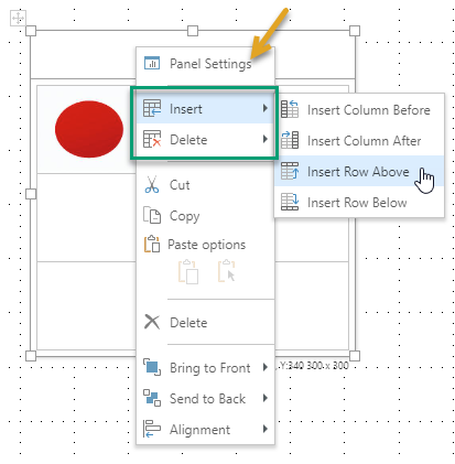
Tip: In addition to the matrix table items, you can also access other items from the context menu. Where the border is selected, this includes the Panel Settings (orange arrow above) which opens the Formatting Panel.
|
Function |
Description |
|---|---|
|
Insert |
Insert columns before or after, or rows above or below, the current selection. If you have the table selected, the column or row is added before or above the first column or row in the table or after or beneath the last. |
|
Delete |
Delete selected columns or rows or cell content. |
- Click here for more information about Matrix Tables