There are a wide range of functions available from the right-click context menus. Which options are included on the menu depends on which content item is selected on the canvas. You typically use the right-click menus when you are professionalizing your publication; for example, when you re-align or distribute your shapes or text boxes, or when you open a visual or another content item in Discover or Illustrate for extended editing.
- Click here for more information about other canvas options
Context menus
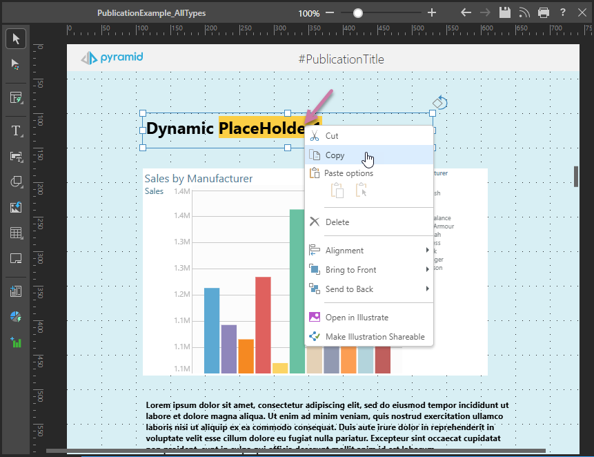
You can open a context menu by right-clicking an object on your canvas. The context menu shows options that reflect the currently selected item or items. For example, the following image shows the context menu (purple arrow) for a Text box:
Basic content item options
The following tables each indicate the type of item that needs to be selected on the canvas for the context menu option to be included on the right-click menu:
Any or no content items selected
|
Function |
Description |
|---|---|
|
Cut or copy the selected object. |
|
|
There are two methods for pasting an item:
|
|
|
Delete the selected object. |
|
|
Where two or more items are selected on the canvas, the items can be "grouped" using this option and the group can then be resized, aligned, moved, copied, cut, or pasted as if it were one item. |
|
|
Align the object with the canvas or with another object on the canvas. |
|
|
Where three or more items are selected on the canvas, distribute those items vertically or horizontally relative to one another. |
|
|
Use one of the two options either to bring the object forward (in front of another item) or to the front (in front of all other items). |
|
|
Use one of the two options either to send the object backward (behind another item) or to the back (behind all other items). |
Visuals selected
|
Function |
Selected Content Item |
Description |
|---|---|---|
|
Visuals, Visual Areas, Mini-Tabs, Matrix Table, Legends. |
Set formatting options for the panel containing the selected visual. Opens the Formatting panel, where the Panel Settings option is selected by default. |
|
|
Visuals |
Set appearance settings for the visual, including Scale mode, Legends (Show / Hide and Optimization), Miniaturization, Auto fit labels (Gauges only), and in the Discover help Optimization, and Trellis. Given this is a publication, the Flow visual toggle is also available. |
|
|
Visual Areas |
As described for Visual Options. |
|
|
Visuals |
Open the visual in Discover to make changes to it. |
|
|
Visuals |
Admin only. Open a discovery in Discover without running the underlying query. This allows you to open and fix problematic content before you run the underlying query against the target data source. It is also useful for very large or long-run queries that can never run to completion. |
|
|
Visual areas |
Open the spreadsheet containing the selected visual area in Tabulate to make changes to it. |
|
|
Visual (linked only) |
Open the content item in its location in the Content Explorer (the file and folder view of the Content Management System, CMS). |
|
|
Visual (linked only) |
Unlink a shared item from its source, making it a one-off visual that is relevant to this publication only. |
|
|
Make Shareable |
Visual (one-off only) |
Save the visual to the content manager so that it can be shared and reused in different visuals, presentations, and publications. |
Shapes, Text, or Images selected
|
Function |
Selected Content Item |
Description |
|---|---|---|
|
Shape, Text, Image |
Open the selected item in Illustrate to make changes to it. |
|
|
Make Illustration Shareable |
Shape, Text, Image |
Save the shape or text to the content manager so that it can be shared and reused in different visuals, presentations, and publications. |
Layout container options
The following tables describe the right-click options that are specific to the layout containers where applicable.
- Click here for more information about Layout containers
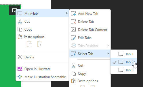
Mini-Tabs
Right-click the Mini-Tab container to open the Mini-Tab submenu:
 .
.
|
Function |
Description |
|---|---|
|
Add New Tab |
By default, the mini-tab container has two tabs. Click this option to add another tab. Note that, by default, the new tab is added after any existing tabs. You will need to Edit the tabs to change its position. |
|
Delete Tab |
Delete the currently selected tab. |
|
Delete Tab Content |
Delete the content item in the currently selected tab. |
|
Edit Tabs |
Open the Edit Tabs panel and edit the settings for the mini-tab container. You can use this panel to change the name of the mini-tab container, add, remove, and move tabs, and change the tab name. |
|
Tabs Position |
Disabled in Publish Pro. |
|
Select Tab |
Indicate which tab to select at build time by default. |
- Click here for more information about Mini-Tabs
Matrix Table
To access the Matrix Table's context menu:
- Right-click the borders of the Matrix Table container.
- Right-click a visual inside the Matrix Table. In this case, there is a Matrix Table submenu.
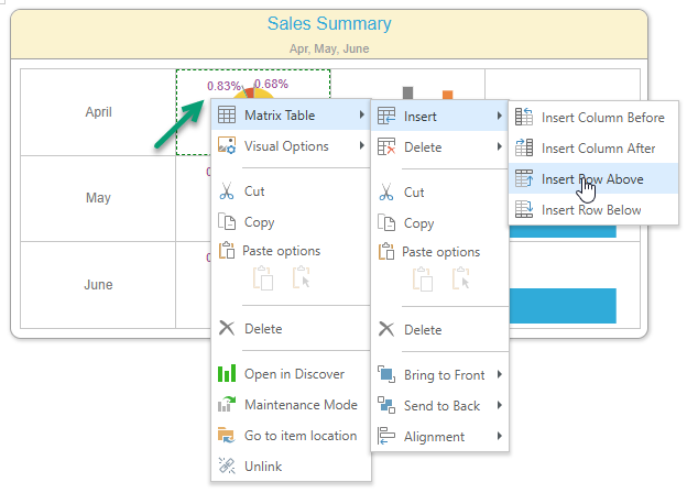
|
Function |
Description |
|---|---|
|
Insert |
Insert columns before or after, or rows above or below, the current selection. If you have the table selected, the column or row is added before or above the first column or row in the table or after or beneath the last. |
|
Delete |
Delete selected columns, rows, or cell content. |
- Click here for more information about Matrix Tables